The Sony Xperia 5 II is an interesting twist on the Xperia 1 II. It’s a downsized and somewhat more affordable device with a smaller display, somewhat fewer bells and whistles, and a few interesting changes, such as a 120 Hz refresh rate and rounded corners instead of Sony’s more typical sharp angles. Inside, the Xperia 5 II has the Android 10 OS with a planned upgrade to Android 11; it’s powered by the Qualcomm Snapdragon 865 chipset, and it comes with 128 or 256 GB of memory and 8 GB RAM.
The display is a 6.1-inch Full HD Plus (1080 x 2520), more modest than the 6.5-inch 4K display of the Xperia 1 II. It maintains the same 21:9 cinematic aspect ratio and has an FHR+ HDR OLED display.
Our engineers put the Sony Xperia 5 II through DXOMARK’s rigorous new display testing protocols; let’s see how it did.
Key display specifications:
- FHR+ HDR OLED
- Size: 6.1 inches (~80.9% screen-to-body ratio)
- Dimensions: 158 x 68 x 8 mm (6.22 x 2.68 x 0.31 inches)
- Resolution: 1080 x 2520 pixels
- Aspect ratio: 21:9, ~449 ppi
- Refresh rate: 120 Hz
About DXOMARK Display tests: For scoring and analysis in our smartphone and other display reviews, DXOMARK engineers perform a variety of objective and perceptual tests under controlled lab and real-life conditions. This article highlights the most important results of our testing. Note that we evaluate display attributes using only the device’s built-in display hardware and its still image (gallery) and video apps at their default settings. (For in-depth information about how we evaluate smartphone and other displays, check out our articles, “How DXOMARK tests display quality” and “A closer look at DXOMARK Display testing.”)
Test summary
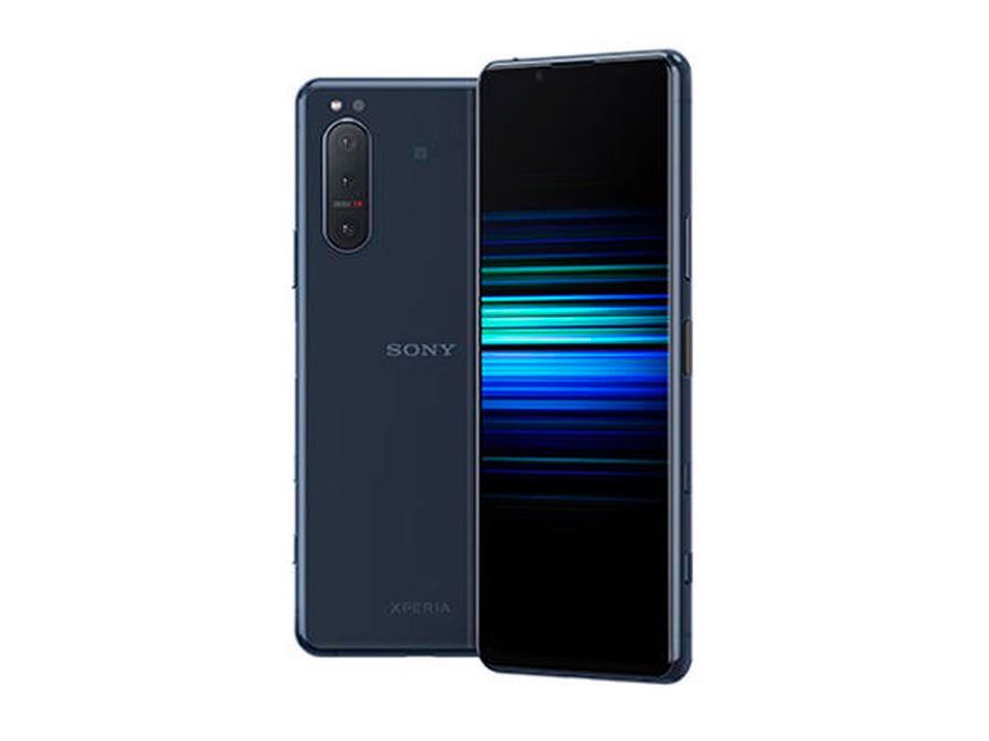 Sony Xperia 5 II


With an overall score of 78, the Sony Xperia 5 II lands in the middle tier of devices we’ve tested for display to this point, slightly above the Oppo Find X2, but not performing well enough to crack the elite set, where the scores are grouped in the upper 80s. The Samsung Galaxy Note20 Ultra 5G (Exynos version) holds the top spot with an 89.
The colors are generally well-rendered in all the tested environments, although the Xperia 5 II over saturates blue colors to a degree. The brightness of the smartphone is well-handled indoors and outdoors in the shade, enhancing readability, although it struggles in bright sunlight, and details become difficult to see. Our engineers noted a lack of image enhancement that would have helped manage readability in bright sunlight better. The video viewing experienced benefits from well-managed motion blur and smooth responsiveness to playback after touching the slider. The Xperia 5 II, however, is not bright enough when displaying HDR10 content, a big drawback, and some frame drops were visible. Our engineers found the Xperia 5 II to be agile in the games scenario, noting precision and fluidity that enhanced the play experience.
The transitions as the smartphone adjusts to diminishing light are not very smooth. The blue light filter, intended to make reading at night less disruptive to sleep, actually makes it more difficult to read because it impairs brightness and adds a distinct orange-pink cast.
Analyses and comparisons
The DXOMARK Display overall score of 78 for the Sony Xperia 5 II is derived from its scores across six categories: readability, color, video, motion, touch, and artifacts. In this section, we’ll take a closer look at these display quality sub-scores and explain what they mean for the user, and we will compare the Sony Xperia 5 II’s performance in several areas against some of its competitors, namely the Samsung Galaxy Note20 Ultra, the OnePlus 8 Pro and the Mi 10 Ultra.

Readability
Sony Xperia 5 II
60
76
DXOMARK uses the device’s gallery app to show static (still image) content when measuring the device’s display for brightness, contrast, gamma, and blue light impact, etc.
The most important aspect of a display is how easily the user can read content in various ambient lighting conditions, and the Sony Xperia 5 II’s score in this attribute is fairly low compared with other flagship devices. The handset got high marks for its brightness in indoor conditions and also when it was viewed outdoors but in the shade. It struggled in night conditions, when it was judged as slightly too dim, and under direct sunlight; the device didn’t brighten enough and there was no evidence of image enhancement that would have helped manage the situation more effectively.
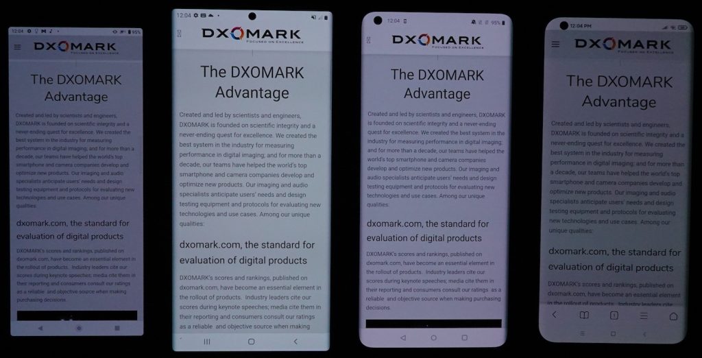
In the side-by-side comparison shot below in a night setting, you can see that the Sony Xperia 5 II (far left) is dimmer than the Note20 Ultra, second from left, or the OnePlus 8 Pro, third from left. But it is a bit brighter than the Mi 10 Ultra, at far right. Our engineers found that the Xperia 5 II was a little too dark overall in night conditions, making content hard to read, but they also noted that for those who like dim screens, it could be OK for reading or browsing. Note: The photos in this review are for illustration purposes only; our engineers perform all perceptual tests with direct observation of the devices.
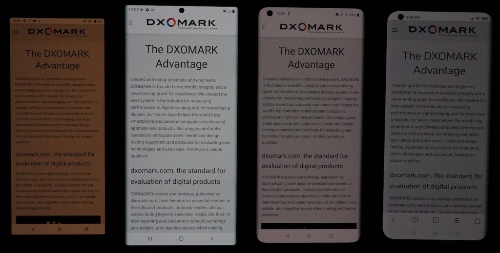
The brightness of direct sunlight is very difficult to counter for most smartphone screens, and the Sony Xperia 5 II fares worse than some others, becoming difficult to read in direct sunlight. The Xperia 5 II does not adjust well to direct sunlight; combined with the low level of brightness it makes the images on the screen difficult to decipher. As you can see below, the image begins to disappear into the dark background compared to the other devices in the illustration that manage the situation more ably. In a previous DXOMARK review, the OnePlus 8 Pro, third from left, was particularly noted for its effective readability in sunlight.

The Xperia 5 II reacts fairly quickly to changes in the amount of available light, but the transitions lack smoothness, and are too abrupt in both rising and falling light levels. It is outperformed by several other devices in this attribute, including the Samsung Note20 Ultra, which made adjustments smoothly and discreetly.
Like many if not most devices, the Sony Xperia 5 II loses some brightness when viewed at an angle:
Here is an on-axis comparison of brightness indoors, showing that the Sony Xperia 5 II measures up well against the comparison devices:

On angle, the Sony Xperia 5 II performs ably, losing some brightness but maintaining its readability:

The Sony Xperia 5 II is already a little too dim at night, but when the blue light filter (BLF) is turned on, it becomes even less readable, with a very strong orange-pink color cast adding to the obscurity. The Samsung Note20 Ultra retains a high degree of readability with the filter on, but it filters very little blue light, in fact, defeating the purpose.

Color
Sony Xperia 5 II
79
92
DXOMARK uses the device’s gallery app to show static (still image) content when measuring the device’s display for white point, gamut, uniformity, color fidelity, and blue light filter impact, etc.
The Sony Xperia 5 II’s color score is above average, tying with the Samsung Note20 Ultra, but not getting too close to the class-leading OnePlus 8 Pro’s top score of 88. The tendency of the device to over saturate blue colors was one of the factors that dragged down its score in this attribute.
In the comparison below, showing color as seen in indoor lighting, the Xperia 5 II renders the vivid yellows and browns of the image quite well. Outdoors, the Sony Xperia 5 II renders color accurately, with acceptable saturation, although with a slightly yellow cast.

In terms of color fidelity, the chart below shows the color tendencies of the Xperia 5 II when under 1000 lux lighting. The center of each circle is the target color; anything outside the circle represents a noticeable color difference. This means that if the tip of the arrow is outside of the circle, a user would notice the difference between the color on the display and color of the real object or chart next to it; the device produces a noticeable blue-green cast.

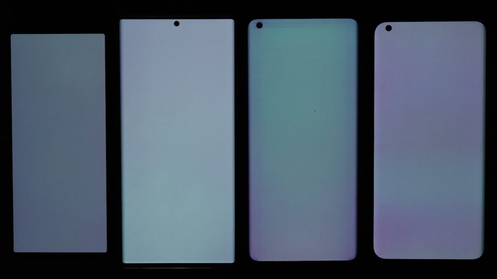
The Sony Xperia 5 II does very well in the attribute of uniformity, unlike many devices we have tested. Each of the other devices in the photo below reveals color shifts and blotchiness, and in the case of the OnePlus 8 Pro, you can see stripes that start at the lens opening extending across the top and left side. Again, this photo an illustration of our perceptual tests, always carried out by direct observation of the devices.
White (color) vs angle
Users don’t consistently look at their smartphones at full-on axis, sometimes holding them at an angle, which can affect display color rendering. The left-hand chart below shows the Sony Xperia 5 II’s color tendencies when held at an angle; in the right-hand chart (essentially a closeup of the left chart), each dot represents a measurement taken at a discrete angle and distance from the device; dots inside the inner circle exhibit no color shift in angle; those between the inner and outer circle have shifts that are just noticeable by trained experts; but those falling outside the outer circle are noticeable. Here you can really see the tendency of the Xperia 5 II to shift toward blues.
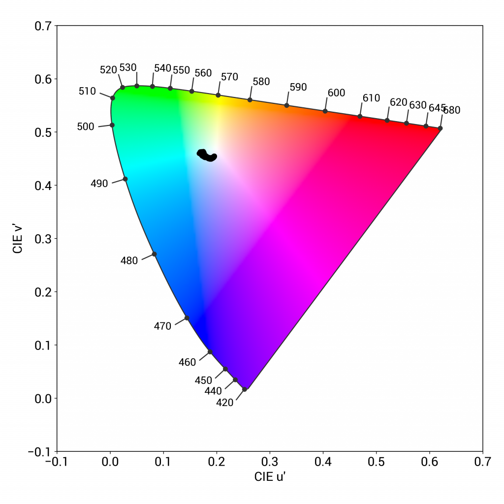
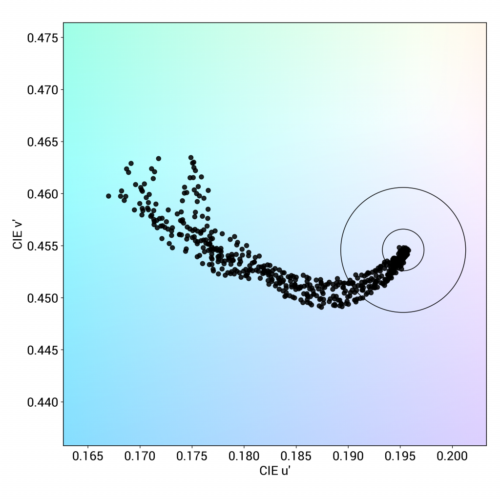
You can see in the photos below how the perceptual analysis lines up with the objective measurements. The top set is shot on axis (perpendicular to the viewer); the second set is shot at a 45° angle.
On axis, the Sony Xperia 5 II renders colors quite accurately, with an adequate degree of saturation. A slightly yellow cast can be detected compared with the other devices:
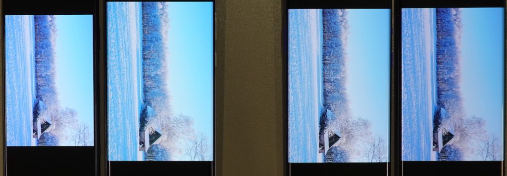
On angle, Xperia 5 II takes a pronounced shift toward a blue-green cast. The OnePlus 8 Pro below has a more pinkish cast on angle.

As mentioned earlier in the readability section, the blue light filter (BLF) of the Sony Xperia 5 II has a very strong orange-pink cast that is a hindrance to easy reading. It’s in fact very effective at removing the blue light that might disrupt sleep, but it’s not managed very adeptly.

Video
Sony Xperia 5 II
58
91
DXOMARK uses the device’s video (or browser) app to show dynamic content when measuring the device’s display for brightness, contrast, gamma, and color.
Brightness when playing HDR10 content was a big issue for the Sony Xperia 5 II. It’s simply too dark, making it difficult to see everything that’s happening on the screen. Worth noting: while the device has the potential to operate at 120 Hz, its default setting is 60 Hz, and that is the refresh rate at which our engineers tested and reviewed the device. The photos here are for illustration purposes, all perceptual tests are carried out under direct observation.

The Xperia 5 II manages contrast somewhat more ably though the dimness is still a factor, as you can see below in an image from a video of glass-blowing. Midtones are fairly well-rendered with visible details, but darker areas are lost. You can see that the Samsung Note20 Ultra manages the scene much more effectively, preserving details while capturing a broader range of tones. The OnePlus 8 Pro loses some details in the highlights.
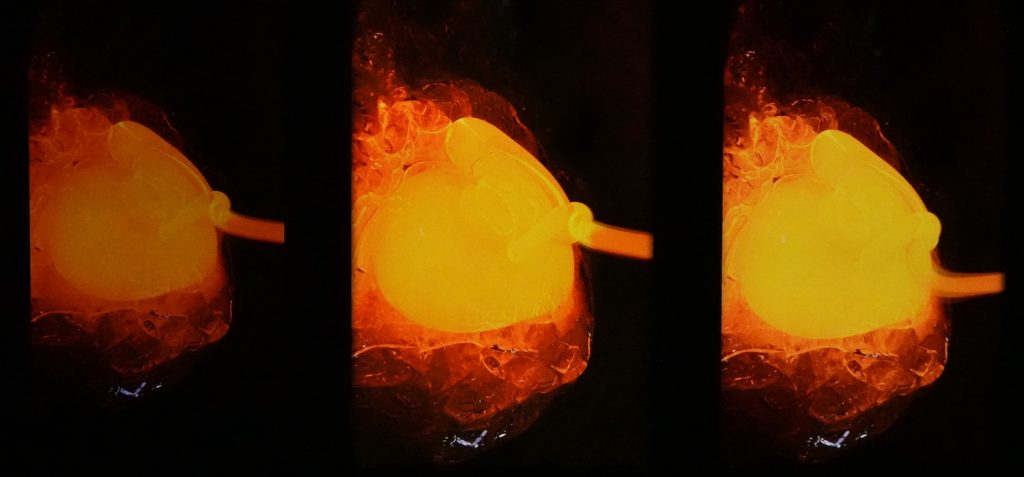
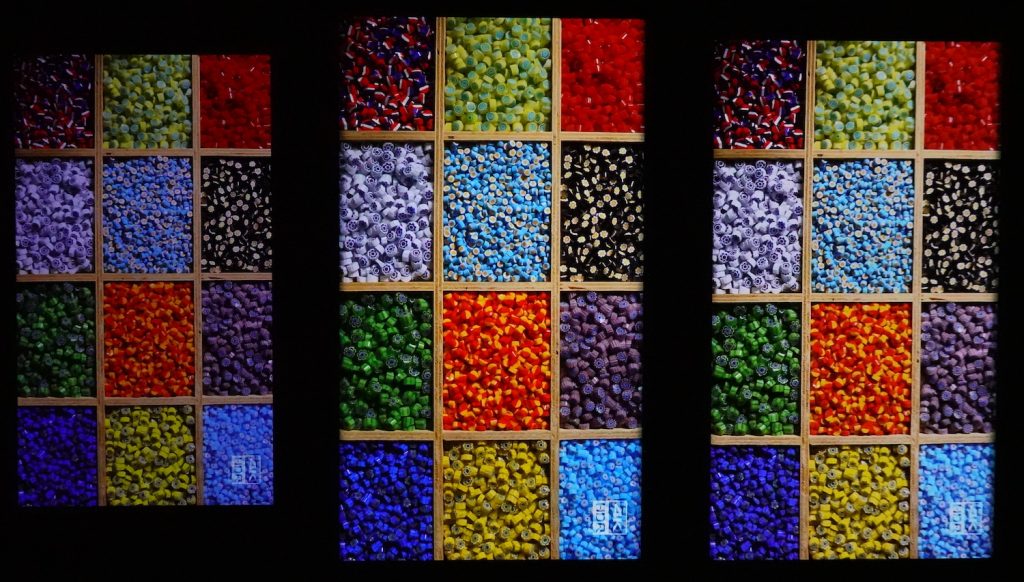
An overall blue cast is noticeable on most of the video our engineers played on the Xperia 5 II, but they found saturation levels appropriate. You can see in the photo below the difference in terms of brightness as well, compared with the Samsung Galaxy Note20 Ultra and the OnePlus 8 Pro.

Motion
Sony Xperia 5 II
84
87
The Sony Xperia 5 II scored well for motion, landing not far from the top-scoring Huawei P40 Pro, which had an 87 for this attribute. The Sony device did show frame drops at 30 fps, to the point where they could be seen with the naked eye, and there were too many frame drops at 60 fps as well. In the gaming use case, the Xperia 5 II was outstanding, displaying no frame drops nor stutter, adding to an overall admirable performance in gaming. As for motion blur, there was no frame duplication when an object moved across the screen, and the overall aspect was quite sharp. In terms of playback reactivity, there was a noticeable but short delay between the moment when the user touches the video player and when the device plays the video. But the device performed well overall in this regard.

Touch
Sony Xperia 5 II
70
85
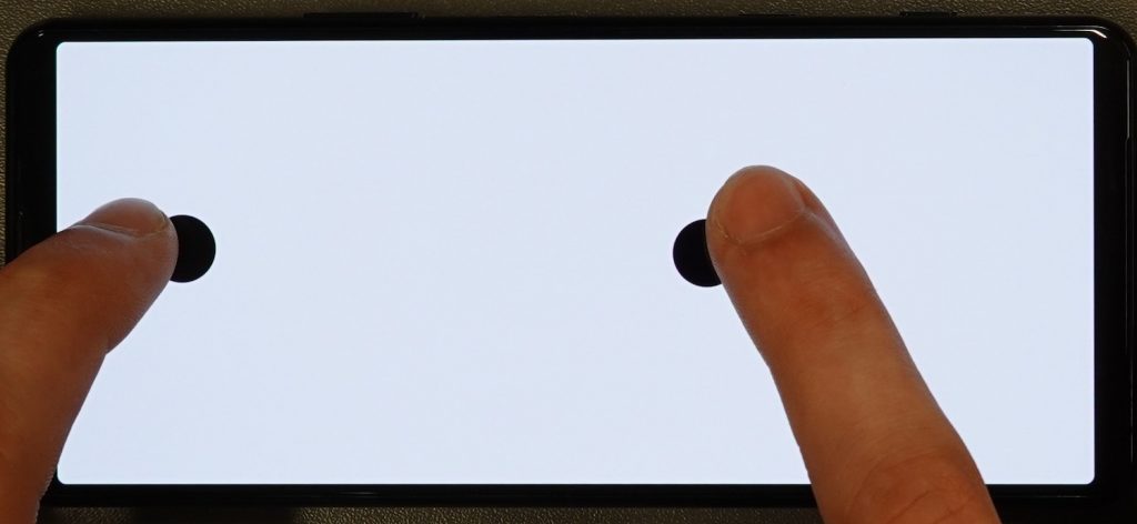
For all end-users, touch is a critical aspect of how enjoyable a smartphone is in daily use. The Sony Xperia 5 II’s performance was a mixed bag in this attribute. Zooming in the gallery app lacks accuracy. The touchscreen doesn’t perfectly follow the user’s fingers as they manipulate the image. On the other hand, the device was very responsive in gaming, earning above-average accolades. The Xperia 5 II is quite smooth when browsing the web or in the gallery app, even if a few frame duplications were visible. Smoothness was also a factor in the positive score in the gaming use case.

Artifacts
Sony Xperia 5 II
78
86
There is no notch on Sony Xperia 5 II, which implies a low screen-to-body ratio: the selfie cam is discretely parked in a band above the display. Aliasing, or pixelation along the edges of smooth curves in images, is an issue that appeared in the gaming use case, giving the imagery a sloppy aspect. Ghost touch, or unintentional activation of the screen with a stray finger or part of the hand, was apparent during several tests. The device doesn’t handle the 3:2 pull down very well, but there was no judder visible at 30 or 60 fps.


Conclusion
The Sony Xperia 5 II turns in an average performance overall among the devices we’ve put through our Display testing protocol to this point. In general conditions — indoors during the daytime and in the shade outside — it is quite readable, has a suitable level of brightness, and renders colors well, although with a slight tendency to oversaturate the blues. It’s in darkness and in bright outdoor conditions that the device falters. The Xperia 5 II doesn’t manage display in direct sunlight as well as some others we’ve tested, and it’s too dim in the dark, especially with the blue light filter on. In terms of video playback, the overall darkness when playing HDR10 contents is a big impediment to enjoying the show, and that outweighs the generally reactive video playback control and well-managed motion blur. A bright point for the Xperia 5 II is its nimbleness as a gaming device. Aside from some issues with aliasing, it’s fun for playing games.
Pros
- Accurate color rendering in general
- Appropriate brightness indoors and in the shade.
- An agile device for gamers
- Handles motion blur well
Cons
- Not very readable in direct sunlight and too dim at night
- Video is way too dark with HDR10 content.
- The blue light filter has such a strong cast that it impedes readability.
- Transitions between different levels of lighting are not smooth.


DXOMARK encourages its readers to share comments on the articles. To read or post comments, Disqus cookies are required. Change your Cookies Preferences and read more about our Comment Policy.