Please note: In the original version of this review, we used the term “burn-in” to describe a non-uniformity that our testers observed on the device’s display. This was a poor choice of words, as it implied that we understood the reason for the non-uniformity. We should have simply let our data-based observation stand on its own, and we apologize for any confusion this may have caused our readers. We have modified the wording in that section and included more test result data about the non-uniformity in this update.
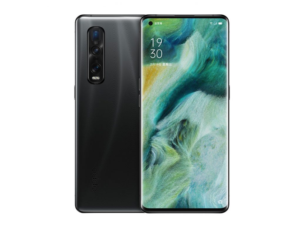
When the Oppo Find X2 Pro first appeared in March 2020, DXOMARK immediately began putting it through its suite of rigorous tests for camera, selfie cam, and audio. In this review, we present a summary of the Find X2 Pro’s performance results for the new DXOMARK Display test protocol.
Key display specifications:
- 6.7-inch AMOLED screen, 19.8:9 aspect ratio
- Resolution: 1400 x 3168 px, screen pixel density: 513 ppi
- Refresh rate: up to 120 Hz
- Small notch in upper left corner (held in portrait mode)
About DXOMARK Display tests: For scoring and analysis in our smartphone and other display reviews, DXOMARK engineers perform a variety of objective and perceptual tests under controlled lab and real-life conditions. This article highlights the most important results of our testing. Note that we evaluate display attributes using only the device’s built-in display hardware and its still image (gallery) and video apps at their default settings. (For in-depth information about how we evaluate smartphone and other displays, check out our articles, “How DXOMARK tests display quality” and “A closer look at DXOMARK Display testing.”)
Test summary
 Oppo Find X2 Pro


With an overall score of 76, the Oppo Find X2 Pro’s performance was mixed, with a somewhat disappointing performance for readability and video, but putting in a good performance for color and control of artifacts.
For content handled by the device’s gallery app (that is, still or single images), our experts found the Find X2 Pro’s display to be on the dim side in nearly all cases, with color shifts noticeably affecting both readability and color fidelity; moreover, it was a bit dim when playing videos. Conversely, however, the Oppo display was too bright in nighttime conditions.
The Oppo Find X2 Pro’s strongest point is color, in which it came in at second place among all tested devices, and it also manages both judder and aliasing well. There are far too many frame drops in our objective tests, though they did not affect the end-user experience in our perceptual tests. However, in terms of its video playback, the Oppo plays instantly, but lags right after for a short moment, leading to a poor user experience.
Analyses and comparisons
The DXOMARK Display overall score of 76 for the Oppo Find X2 Pro is derived from its scores across six categories: readability, color, video, motion, touch, and artifacts. In this section, we’ll take a closer look at these display quality sub-scores and explain what they mean for the user, and we will compare the Find X2 Pro’s performance in several areas against two of its principal competitors, the Samsung S20 Ultra and the Apple iPhone 11 Pro Max.

Readability
Oppo Find X2 Pro
59
76
DXOMARK uses the device’s gallery app to show static (still image) content when measuring the device’s display for brightness, contrast, gamma, and blue light filter impact, etc.
The most important aspect of a display is how easily the user can read content in various ambient lighting conditions. Ideally, a user whose phone is set to automatically adjust display brightness should rarely if ever have to manually adjust it, whether because it’s too dim to see well in bright daylight or because its brightness at night makes the user wince at first glance.
Our testers found the Find X2 Pro’s overall brightness to be too low both in daylight conditions and indoors when using the phone’s gallery app; conversely, it was too bright at night, with or without the blue light filter turned on. But not everything was negative for readability: while not the best for this, the Find X2 Pro was fairly quick and smooth when adjusting brightness levels, and it also did fairly well when viewed at an angle.
Below you can see the relationship between brightness and contrast for the Find X2 Pro and for its rivals under different lighting conditions. Note that when contrast decreases, it is due to the ambient light reflected by the device — the more intense the ambient light, the lower the device’s contrast, unless it can compensate by providing more luminance.
The Oppo Find X2 Pro has low contrast and low brightness indoors:

Outdoors, the Oppo’s readability is low due to contrast loss:

The Find X2 Pro came in on the low side in the readability vs. ambient light sub-category, in part because its automatic increase in brightness was too quick and not sufficient to compensate for the loss of contrast, making it essentially unreadability in bright outdoor conditions. Further, its relatively low sub-score for gamma (which affects dark areas in particular) was particularly impacted by its performance in DXOMARK’s perceptual tests, with our experts finding the overall appearance unnatural-looking. (Click on any of the device names in the graph below to select or deselect them so you can see their individual results and/or compare one or more at a time as you wish.)
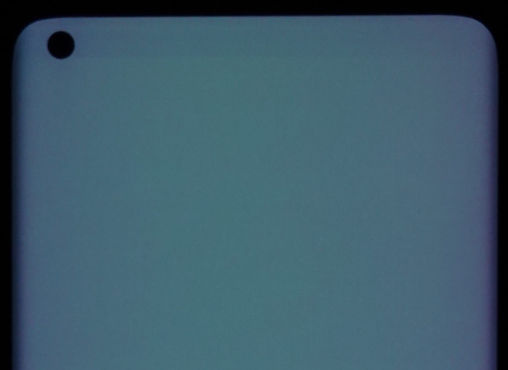
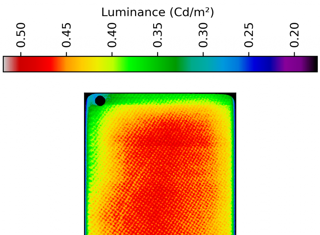
Another area in which the Oppo did not do well in our objective and perceptual tests was for uniformity. The device is not very uniform at low gray levels, and the display shows a gradient — it’s brighter in the center of the screen and darker along the edges.
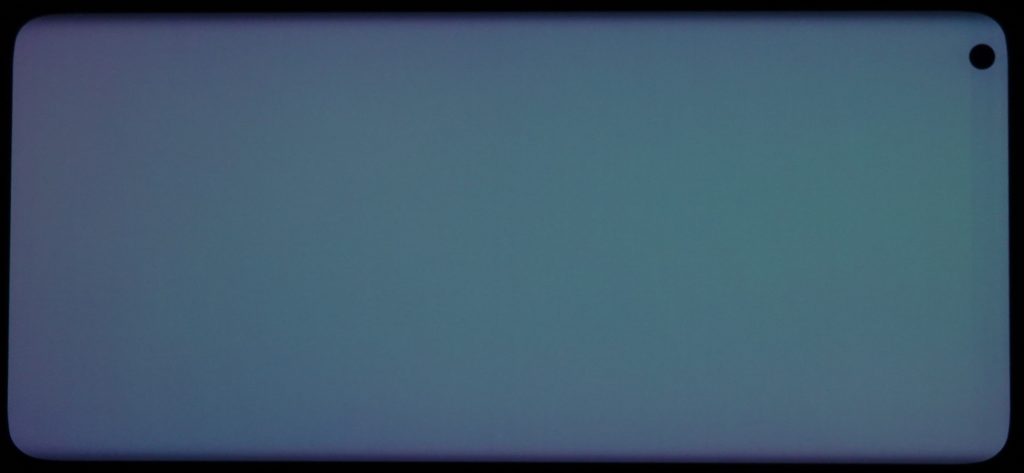
As shown in the cropped photo below left, there are noticeable gradient stripes that appear to emanate from the left-corner pinhole notch. This observation is backed up by our luminance uniformity map, measured with a Radiant ProMetric® Imaging Colorimeter, as shown on the right:
When viewed at an angle, the Find X2 Pro’s brightness losses are uneven, as you can see in the chart below, which reduced its score in this category. However, its contrast loss was nonetheless acceptable, with the Oppo doing well overall in our perceptual angle tests; by contrast, the iPhone did very poorly. (Click on any of the device names in the graph below to select or deselect them so you can see their individual results and/or compare one or more at a time as you wish.)
Blue light filter impact
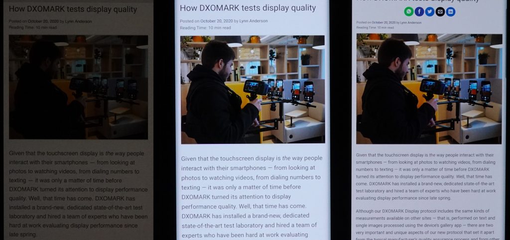
Although our objective tests showed that the Oppo Find X2 Pro lost a significant amount of brightness with the BLF turned on, our perceptual tests revealed that it was too bright in nighttime conditions, regardless of whether the blue light filter (BLF) was turned off or on. As you can see in the comparison photos below, both the Oppo and the Samsung devices are too bright for the ambient light conditions, but the Oppo is noticeably brighter than the Samsung. By contrast, the Apple device is a bit too dim.
Without BLF in nighttime conditions:
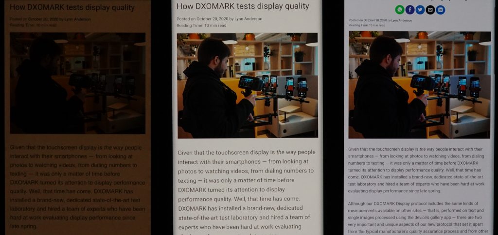
With the blue light filter on in nighttime conditions, you can see in the photos below that the Find X2 Pro remains too bright, with a slight color shift toward orange. Among the three devices, the Samsung is the best; by contrast, the iPhone 11 Pro Max shows a significant orange shift and is too dark to be readable.

Color
Oppo Find X2 Pro
80
92
DXOMARK uses the device’s gallery app to show static (still image) content when measuring the device’s display for white point, gamut, uniformity, color fidelity, and blue light filter impact, etc.
Color on the Oppo Find X2 Pro was a clear strength, and with 80 points, it came in second, tied with the Xiaomi Mi 10 Ultra — though not closely, as the number 1 device for this attribute, the OnePlus 8 Pro, scored a whopping 88 points.
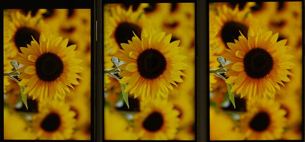
Even with a slightly green cast, the Oppo’s rendering indoors (middle photo) is pleasant:
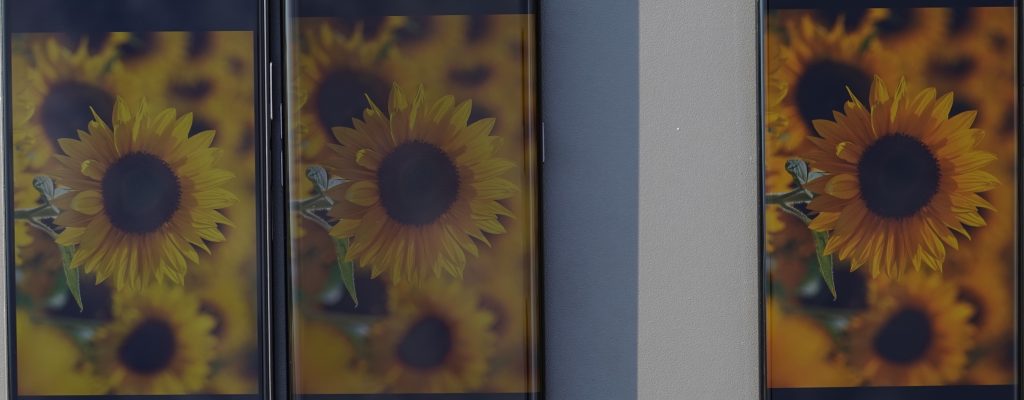
However, its colors appear a bit washed out outdoors:
Color vs angle
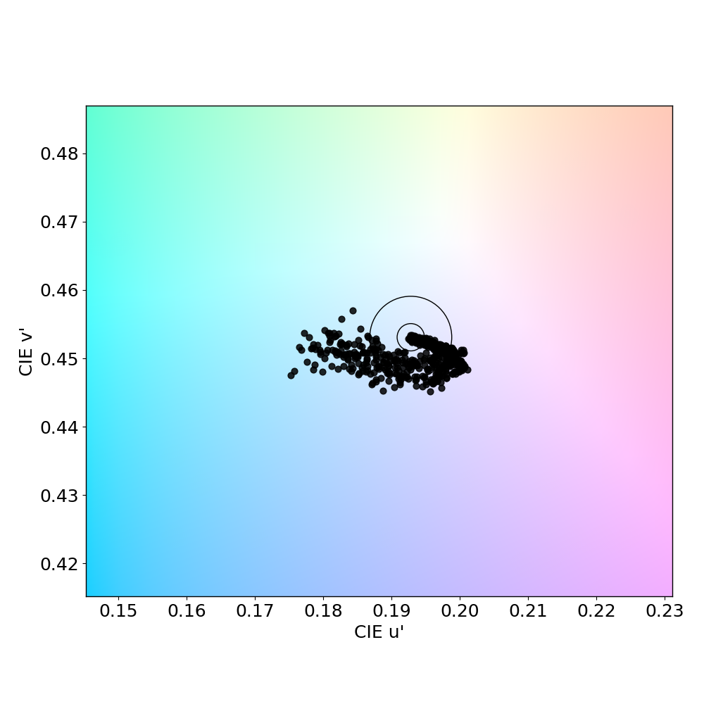
Users don’t consistently look at their smartphones full-on, sometimes holding them at an angle, which affects how well they can see certain aspects of the display. Angle affects color, and the Oppo is no exception in this regard. Our objective tests for white point on angle back up our perceptual evaluation. In the left-hand chart below, you can see that the Oppo’s white point already starts out in pink territory. The right-hand chart is essentially a closeup of the left chart’s results, with each dot representing a measurement taken at a discrete angle and distance from the device; dots inside the inner circle exhibit no color shift; those between the inner and outer circle have shifts that are just noticeable by trained experts; but those falling outside the outer circle are noticeable.
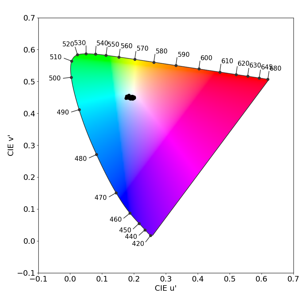
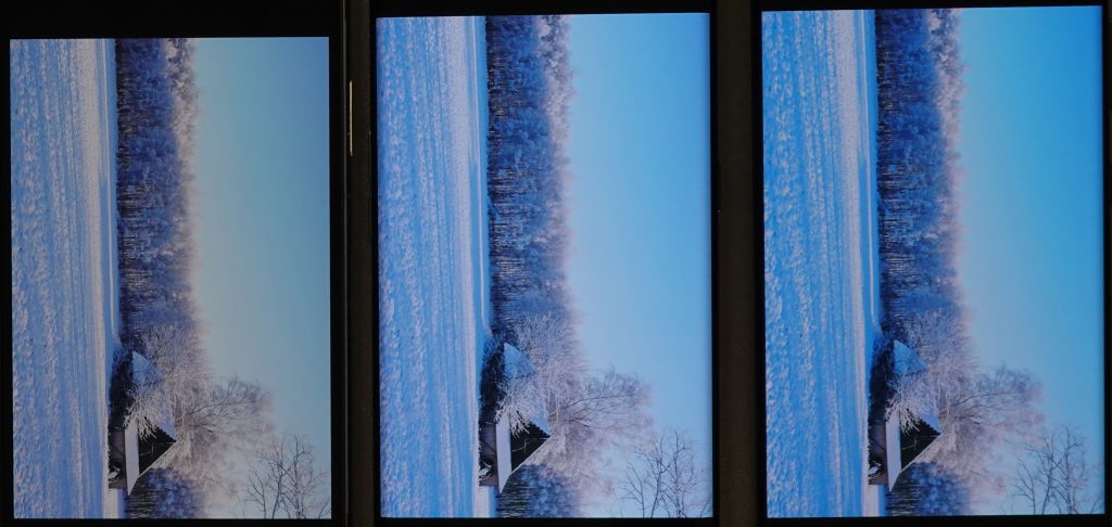
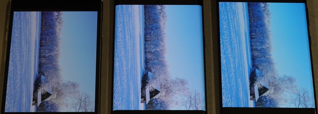
Though not a hugely pronounced shift to pink, you can nonetheless see it in the Oppo photo in the comparison photos below:

Video
Oppo Find X2 Pro
56
91
DXOMARK uses the device’s video (or browser) app to show dynamic content when measuring the device’s display for brightness, contrast, gamma, and color.
The Oppo Find X2 Pro’s brightness is good when playing SDR video content, but it is sometimes a bit low for HDR10 content. Video colors on the Oppo are very desaturated, however, making it one of the worst for this sub-attribute, whereas the Samsung was the best among all tested devices so far. Apple video output, when bright enough to analyze, showed a strong yellow cast.


Motion
Oppo Find X2 Pro
77
87
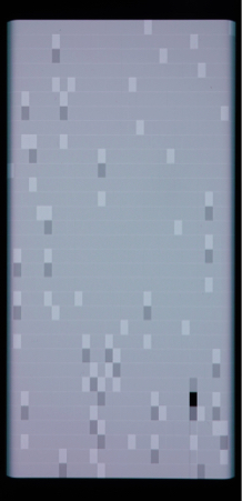
The Oppo Find X2 Pro’s score for motion was on the low side. But although our experts didn’t see any frame drops during our perceptual gaming tests (as was also the case for the Samsung, with the Apple dropping frames only rarely), DXOMARK’s objective tests showed that the Oppo has a lot of stutter and frame drops when played at both 30 fps and at 60 fps, as you can see below.
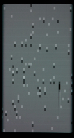
Further, the Oppo deals very well with all resolutions no matter the frame rate, and both it and the iPhone control blur well, better than the Samsung. That said, a big negative was the Find X2 Pro’s video playback reactivity, which would begin playing instantly, but then showed lags after starting, leading to a poor user experience.

Touch
Oppo Find X2 Pro
69
85
The Find X2 Pro put in an acceptably average performance in one segment of our gaming use case, in which we use the classic Minesweeper game to assess touch accuracy. The Oppo device delivered an enjoyable gaming experience overall, but had a few problems: it was sometimes necessary to try more than once to flag a box, and sometimes the Oppo did not correctly register the duration of the touch, which resulted in the game cell or box opening rather than a flag being placed. These problems with touch accuracy were more pronounced along edges of the device. That all said, the Oppo soundly beat both the Samsung and the Apple in tests based on this game.
For touch accuracy when browsing, however, it was a different story: in contrast to the Apple device, the Find X2 Pro’s touch response was not very accurate when pinch-zooming in the gallery app, though it is better than the Samsung.
Moreover, it was also a different story for touch smoothness. In this dynamic gaming use case, our testers “drive” a car; they report that the Oppo’s movement control feels abrupt by comparison with its competitors. But when it came to touch smoothness for browsing, however, the Oppo device was the best among the three devices.

Artifacts
Oppo Find X2 Pro
82
86
The Oppo Find X2 Pro scored well for artifacts. First of all, it has the smallest notch of the three tested devices, though its corner position can be a bit more intrusive than center-placed notches when gaming or watching video in landscape mode.
Because of their glossy finish, all smartphone screens have some degree of reflectance, particularly in bright light. The Oppo’s reflectance rate was average in this regard. As for flicker (which all displays do to some degree), the Oppo is largely unremarkable in this regard, even though our trained experts perceived it during testing, which is unusual.
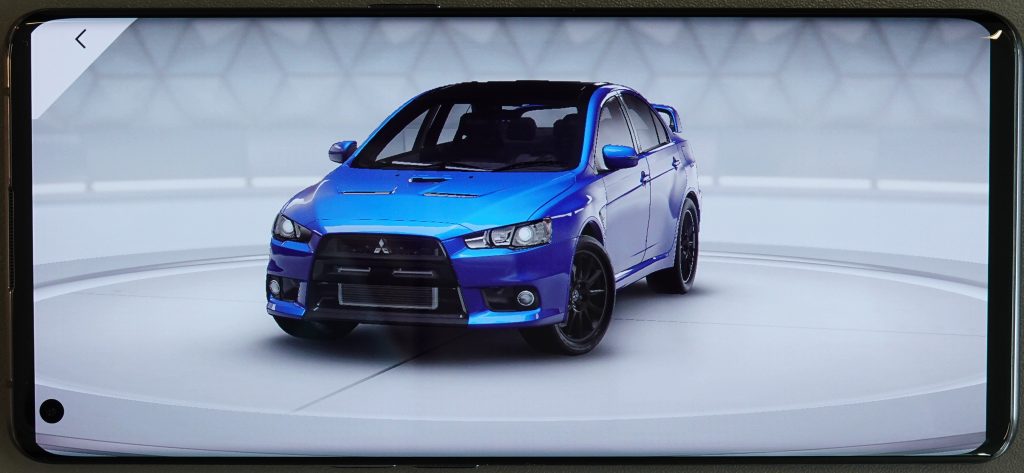
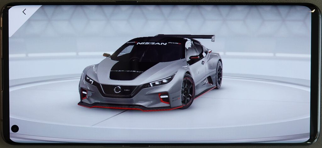
Though not as good as the iPhone in controlling aliasing, the Find X2 Pro manages it well overall, although it could do better, as the sample photos below show. (Note that these photos are for illustration purposes only.)
The Find X2Pro had no problems with ghost touches, and both it and the iPhone performed well for judder.
Conclusion
Significant problems with readability for still image (gallery app) content and a subpar video handling hobble the Oppo Find X2 Pro’s display performance. Its scores for readability were particularly disappointing, as the display’s auto-brightness settings were too dim for bright light conditions and too bright for comfortable nighttime reading. However, it had good color rendering for still images and controlled artifacts well overall.
Pros
- Color is good for still image (gallery app) content.
- Judder and aliasing are well managed.
- No problems with ghost touches
Cons
- Display is unreadable in bright sun-lit conditions due to poor contrast.
- Color shifts on angle are too pronounced.
- Too many frame drops when playing videos.
- Some noticeable non-uniformity



DXOMARK encourages its readers to share comments on the articles. To read or post comments, Disqus cookies are required. Change your Cookies Preferences and read more about our Comment Policy.