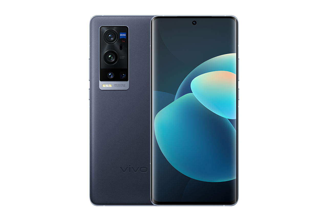
Appearing on the market in January 2021, the large Vivo X60 Pro+ is one of the Chinese manufacturer’s latest top-of-the line models, coming with a host of high-end features, including a quad camera setup with Zeiss lenses. In this review we summarize how well it performed in our Display protocol tests.
Key display specifications:
- Super AMOLED screen
- Size: 6.56 inches (~89% screen-to-body ratio)
- Dimensions: 158.6 x 73.4 x 9.1 mm (6.24 x 2.89 x 0.36 inches)
- Resolution: 1080 x 2376 pixels
- Aspect ratio: 19.8:9, 398 ppi
- Refresh rate: 120 Hz
About DXOMARK Display tests: For scoring and analysis in our smartphone and other display reviews, DXOMARK engineers perform a variety of objective and perceptual tests under controlled lab and real-life conditions. This article highlights the most important results of our testing. Note that we evaluate display attributes using only the device’s built-in display hardware and its still image (gallery) and video apps at their default settings. (For in-depth information about how we evaluate smartphone and other displays, check out our articles, “How DXOMARK tests display quality” and “A closer look at DXOMARK Display testing.”)
Test summary
 Vivo X60 Pro+


 23rd
23rd
 17th
17th
Pros
- Adapts rendering according to the color space of the content, improving color faithfulness
- Manages frame drops well when gaming and when watching videos
- Well-controlled and smooth brightness transition
Cons
- Low brightness impacts video performance, particularly in the rendering of details in dark areas.
- Poor touch sensitivity in corners and along edges. Gaming experience could be much smoother.
- Could be brighter in most environments except for low light, where the screen is too bright for comfortable viewing.
The Vivo X60 Pro+’s overall score of 89 reflects a solid performance in most of our protocol tests, and places it firmly in the upper half of our database of devices tested so far. In this review, we compare the X60 Pro+ with brand stablemate Vivo X51 5G, and with two ultra-premium competitor devices, the Apple iPhone 12 Pro Max and the Samsung Galaxy S21 Ultra 5G (Exynos).

Readability
Vivo X60 Pro+
72
76
DXOMARK uses the device’s gallery app to show static (still image) content when measuring the device’s display for brightness, contrast, gamma, and blue light impact, etc.
The ease with which you can see the content on your phone’s display is obviously very important. Fortunately, the Vivo X60 Pro+ provides fairly good readability, coming in only two points behind the category leaders, the Samsung Galaxy S21 Ultra 5G (Exynos) and the TCL 10 Pro.
Though its overall readability puts it into joint third place with several other devices in our database, the Vivo X60 Pro+ is not quite as bright as it could be when indoors (first array below) or in shady outdoor conditions (second array), as it loses the darkest details.


Under direct sunlight, however, the Vivo device shows improved readability, even though its maximum brightness is still a bit too low. (In fairness, most devices struggle with readability in sunlight.)

The X60 Pro+’s reaction time to rising light levels is adapted to the human eye’s response to light changes, though our engineers noticed multiple small steps as the device responded to falling light conditions. Outdoors, transitions are smooth. Device brightness is almost uniform.
The Vivo X60 Pro+ loses brightness and contrast when viewed on angle, but manages better than its competitors, as you can see in the chart below as well as in the on-axis and on-angle photo arrays below:

Although it lacks a bit of brightness in indoor and shady conditions, the Vivo X60 Pro+’s display in a low-light environment is somewhat dazzling. And while its brightness level is more comfortable for viewing with the blue light filter (BLF) turned on, it is still quite bright.

Color
Vivo X60 Pro+
85
92
DXOMARK uses the device’s gallery app to show static (still image) content when measuring the device’s display for white point, gamut, uniformity, color fidelity, and blue light filter impact, etc.
Its score of 85 puts the Vivo X60 Pro+ into fifth place in our database thus far, and is indicative of good color rendering overall, though it doesn’t do quite as well as the X51 5G (87 points). This may be because the X60 Pro+’s colors tend to look paler than the reference photo’s, and there is a slight but noticeable green cast.

The same paleness and slightly green cast are more visible under sunlight:

The charts below show the Vivo X60 Pro+’s color reproduction fidelity when under 1000 lux lighting in both the sRGB (standard) color space (left) and the broader DCI-P3 color space (left). The center of each circle is the target color; anything outside the circle represents a noticeable color difference. The further the tip of the arrow is outside of the circle, the more a user will notice the difference between the color on the display and color of the real object or chart next to it. As you can see, the X60 Pro+ has quite good performance but lacks some faithfulness in terms of the orange hues in the DCI-P3 space on the right:


Our experts did not see any color adaptation when the ambient illuminant changes. Indoors, the overall rendering is a bit paler than the reference image; and while that same slight but noticeable green cast can also be seen in outdoor photos (which are likewise a bit pale, though saturation is good), the X60 Pro+’s cast is nowhere near as apparent as the iPhone’s.

The Vivo X60 Pro+ shows something of a pink cast while still close to being on axis; this turns into a blue cast as the angle becomes more acute, per the color scatter chart on the right:
Device output looks even paler when viewed from an angle than when viewed on-axis. What is at first a slight pink cast turns to blue as the angle increases.

Particularly in comparison with its Apple and Samsung competitors in the photo array below, the X60 Pro+’s color uniformity is quite good, even though there is a subtle color shift around the notch and along the edges.
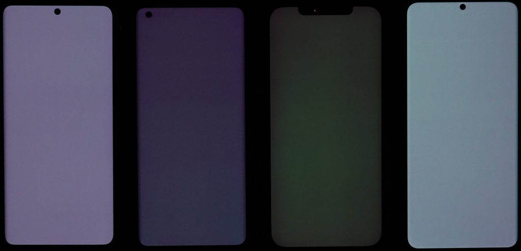
When BLF is turned on, the Vivo X60 Pro+ shifts to a noticeable orange cast (though far less noticeable than the Apple’s very dark orange color).
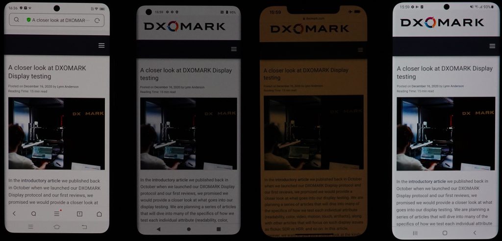
BLF on, from left to right: Vivo X60 Pro+, Vivo X51 5G, Apple iPhone 12 Pro Max, Samsung Galaxy S21 Ultra 5G (Exynos)

Video
Vivo X60 Pro+
65
91
DXOMARK uses the device’s video (or browser) app to show dynamic content when measuring the device’s display for brightness, contrast, gamma, and color.
As for Video, the Vivo X60 Pro+’s score of 65 is some 25 points behind the Samsung (Exynos)’s 90, which tops the list for this attribute both among our comparison devices here and across the database as a whole. The main issue for the X60 Pro+ is that target brightness is a bit low to be able to fully appreciate HDR10 content in particular:
As you can see in the comparison array below, the X60 Pro+ (far left) is on the dark side, though better than the X51 5G to its right:

Further, the Vivo X60 Pro+ shows a lack of saturation and color inaccuracies when viewing HDR10 content.

These same problems — lack of brightness and saturation, as well as color inaccuracies — also impact the X60 Pro+’s rendering of skin tones.

Motion
Vivo X60 Pro+
84
87
Despite the Vivo X60 Pro+ showing some frame drops at 30 fps (fewer at 60 fps) in our objective lab testing, our engineers did not notice any when playing video games. While the device shows a few frame duplications, and that it pauses and then resumes video playback rather unsmoothly, none of these problems was serious enough to significantly impact the X60 Pro+’s motion score (currently in joint third place with several other devices).

Touch
Vivo X60 Pro+
62
85
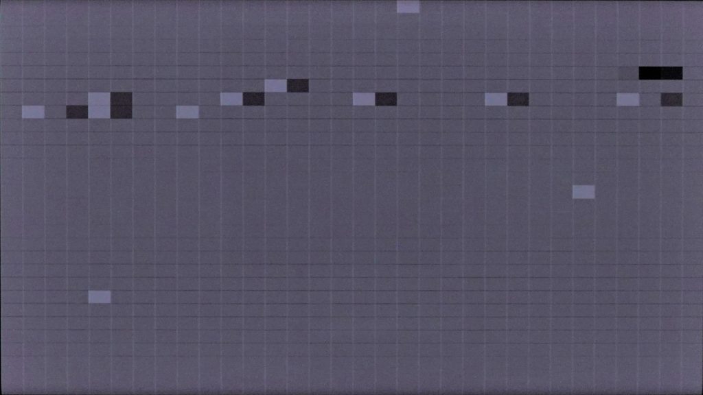
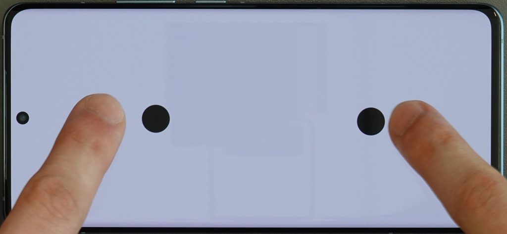
Although it racks up a few more points than the X51 5G model at 59, the Vivo X60 Pro+ did not score well for touch. Zooming in the gallery app is quite accurate, but the zoom is capped. More seriously, while touch is accurate in the center of the screen, bottom corners and edges are extremely difficult to select when gaming.
Although it is very smooth when browsing on the web, the Vivo X60 Pro+ is not smooth when gaming, which greatly affects the user experience.

Artifacts
Vivo X60 Pro+
83
86
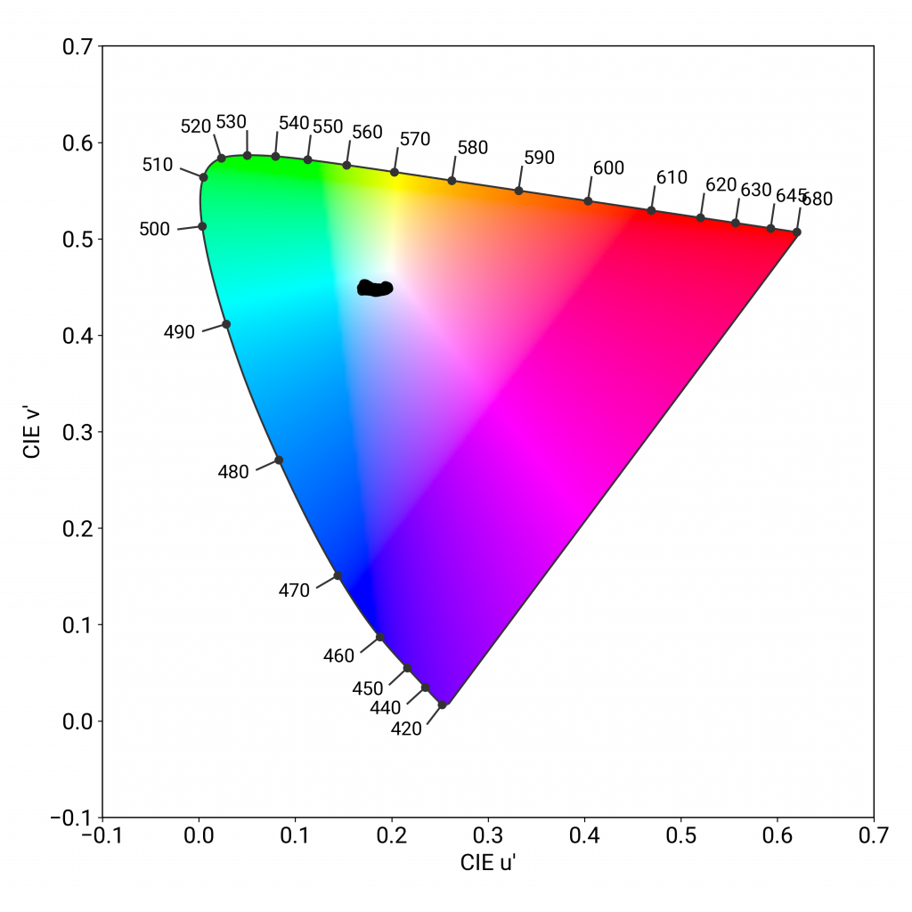
The Vivo X60 Pro+’s mean reflectance is 4.7%; the graph below shows its reflectance curve over the visible spectrum:
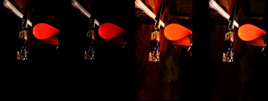
Like the Apple and Samsung comparison devices, the Vivo X60 Pro+ shows some flicker effects at low light levels:
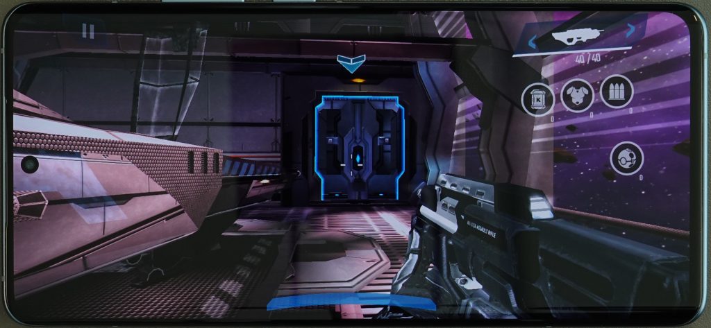
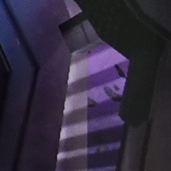
The X60 Pro+ shows some judder at 24 fps, but not at 30 or 60 fps. While ghost touches rarely occur, its biggest problem is with aliasing, which is quite visible when gaming:
Some closeups:
Conclusion
The Vivo X60 Pro+’s principal weakness is touch, where it could use greater sensitivity along its edges and in the corners. Its color is quite good, as is its readability in the gallery app; a good opportunity for improvement would be increasing its brightness when playing back videos. That all said, the Vivo X60 Pro+ puts in a very respectable display performance overall.






DXOMARK encourages its readers to share comments on the articles. To read or post comments, Disqus cookies are required. Change your Cookies Preferences and read more about our Comment Policy.