
The user experience is a key focus in all of DXOMARK’s testing. Portrait photography from smartphones has recently been a topic of great interest at DXOMARK. In addition to testing, we have also been running various Insights across the globe about user preferences when it comes to portraits. While our Insights documented clear regional preferences, our studies also identified that in each region, individual complexities such as age or photography experience had a significant impact on preferences, which indicated that the more users can truly individualize their photos, the more satisfied they will be with them.
With its latest flagship, the iPhone 16 Pro Max, and other 16-series models, Apple has provided an innovative feature that addresses this very topic by adding more base tones to its “Photographic Styles.” The addition of tones such as Cool Rose, Neutral, Rose Gold, Gold, and Amber, can give images a very personalized look via tone and warmth. Apple’s website says that “the Photographic Style you select will be specific to the skin undertones your camera captures,” and that “you can make adjustments to it in Camera or edit it in the Photos app.”
We ran a further study on this new feature to see how it works from a technical standpoint. We also wanted to see how the feature would resonate with a small group of everyday consumers.
How we tested the undertones feature
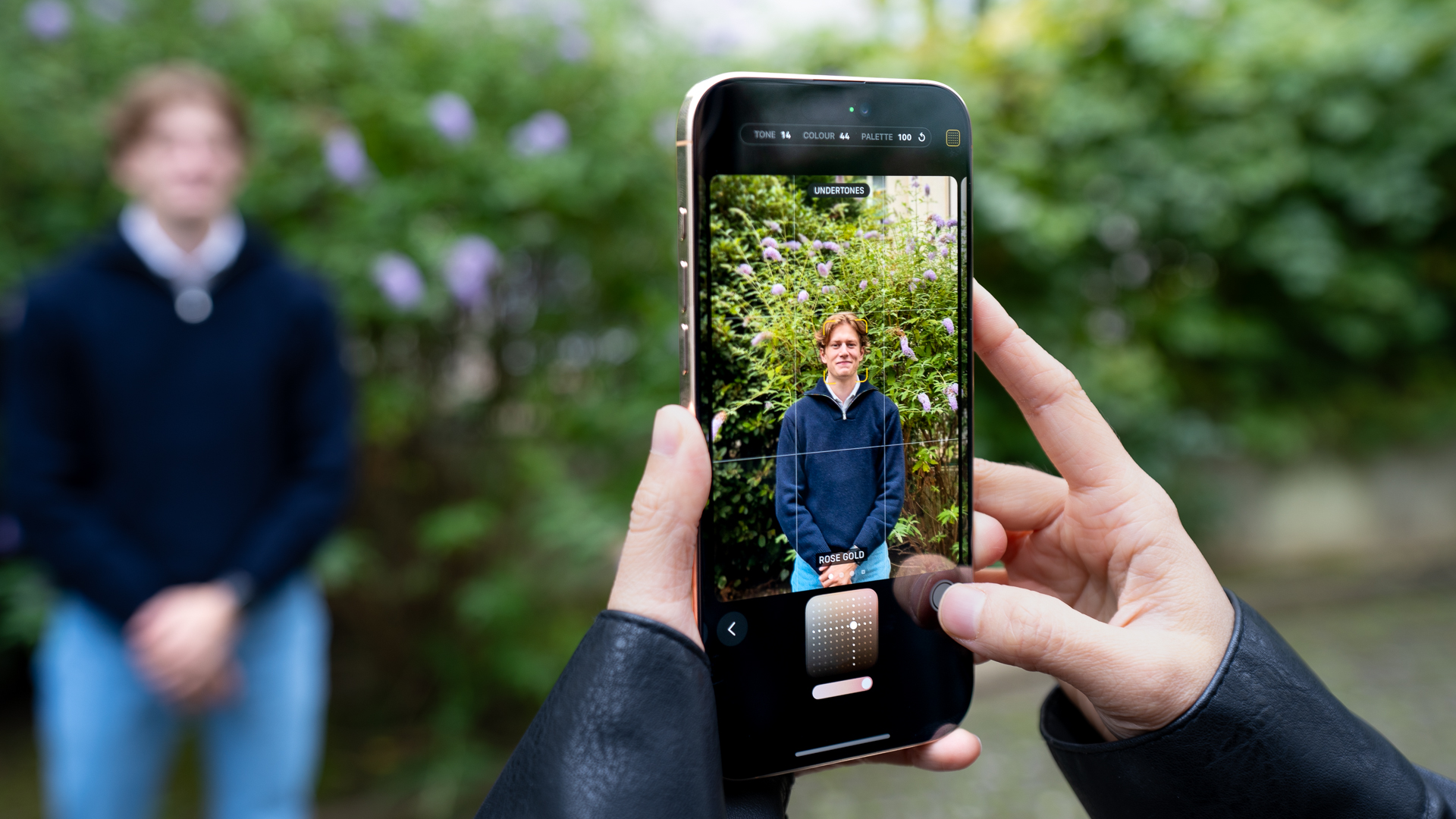
In a very informal two-day experiment that applied the principles of our Insights methodology (but on a smaller scale), we gathered 10 people in Paris representing a range of skin tones to test what they thought of their portraits when applying these undertones to their photos and asked them to choose their preferred rendering using a blind test comparison method. The experiment involved shooting 30 scenes in which we took individual and group photos using each of the iPhone’s new undertone settings and compared them with the standard image results from the Samsung Galaxy S24 Ultra (released in January) and the Google Pixel 9 Pro XL (released in August), the flagship phones from the iPhone’s closest competitors.
We asked the participants to indicate their preferred image twice: once on the smartphone screen immediately after capture and then on a computer screen. For the latter, participants viewed the HDR pictures under standardized conditions (ISO-22028-5) with compatible HDR screens. In addition to being displayed according to each manufacturer’s HDR settings, the pictures were also shown at smartphone-size dimensions.
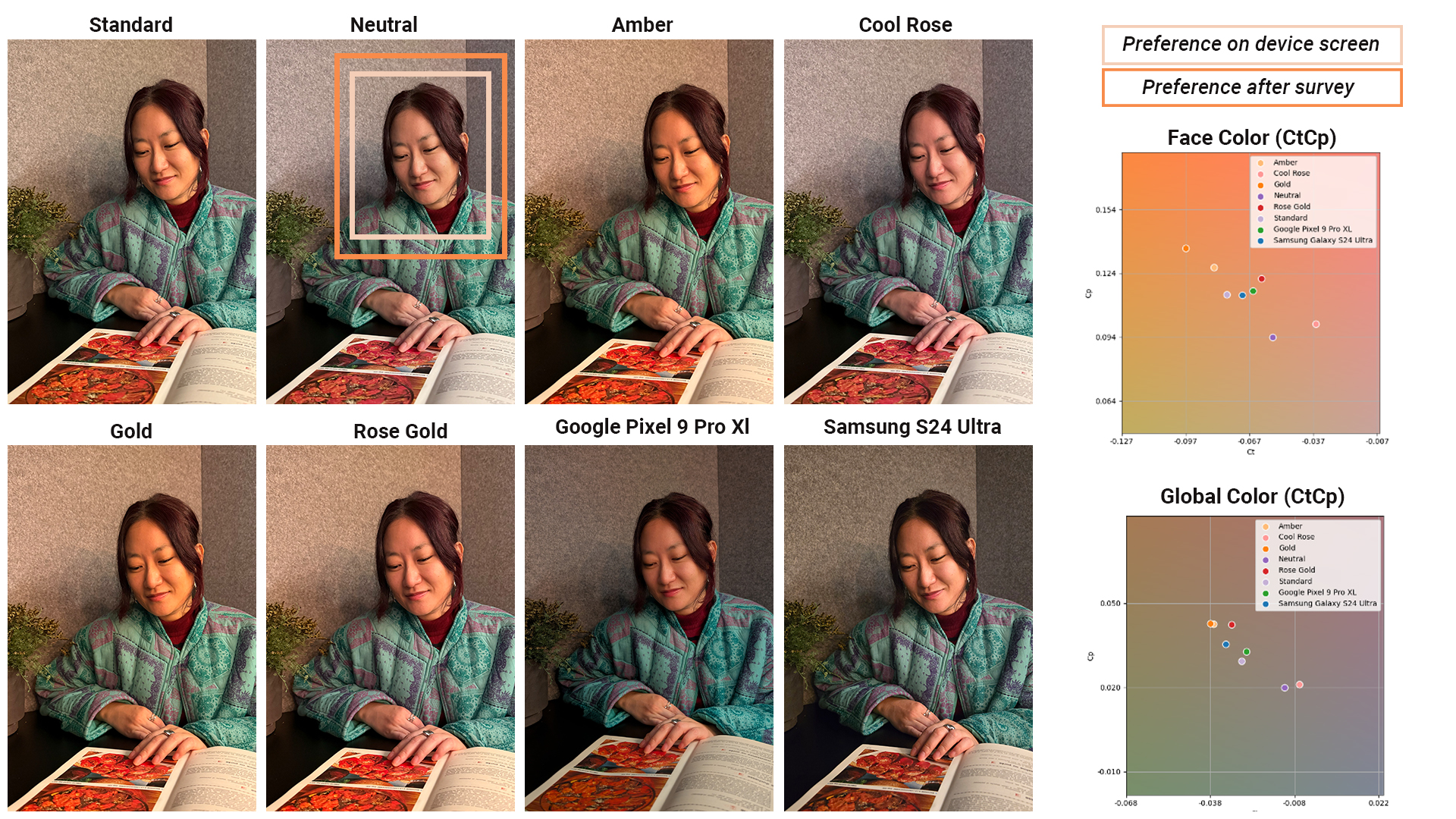
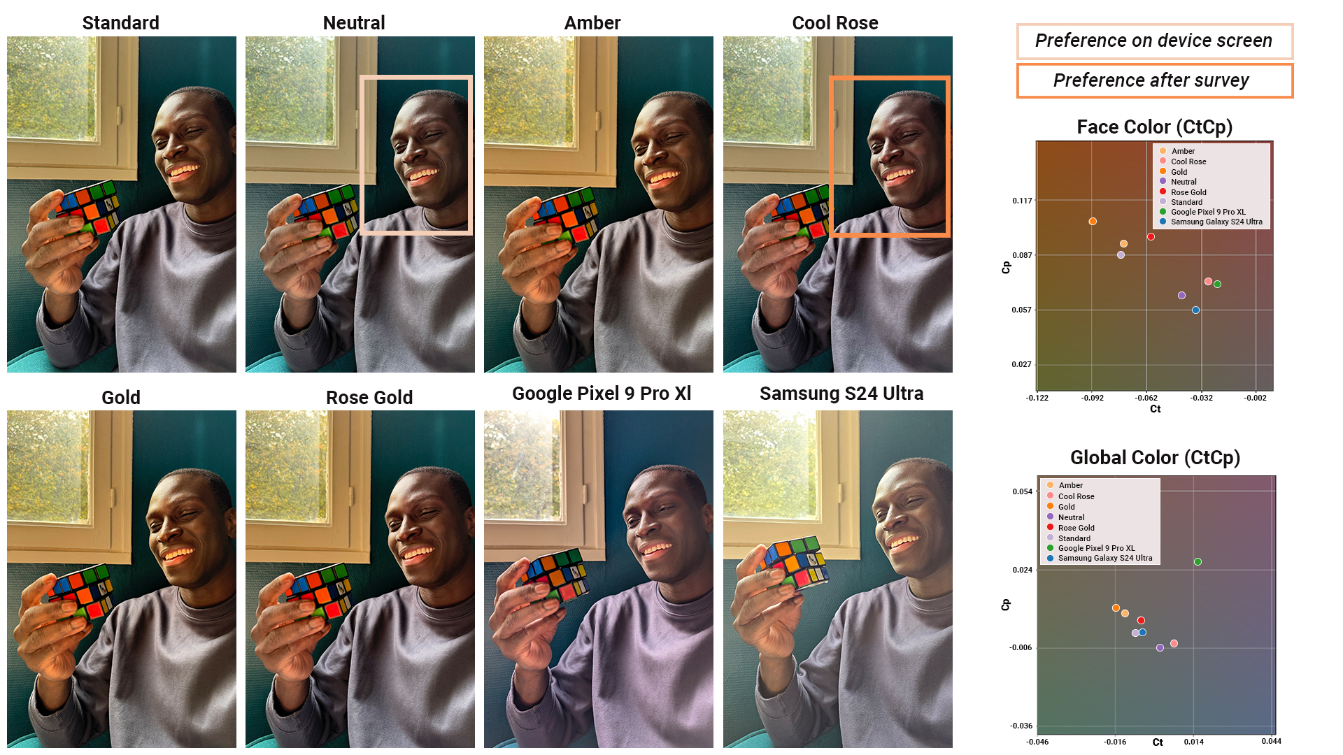
What happens to the color of the image when the new photographic styles are applied? In our brief experiment, we saw that there was no significant impact on the face brightness and that the undertone modified not just the skin tones, but also had a global impact on colors in the image to a lesser extent.
For all images in the study, we were able to measure how skin tone (on cheeks and forehead) is rendered, and we also included an 18% gray patch in part of the images to measure the impact of different undertone settings on an image’s white balance. In this way, we were able to measure the degree to which each style changed the image’s grays and skin tones from the standard. We averaged indoor scenes with different skin tones to show the impact the feature had on the colors in the image.
The following graph is a chromaticity map (in the ICtCp color space that we use for HDR images), and it shows how the different devices and how the iPhone’s undertone settings render gray areas in the image and the skin tone measured on models’ skin in these scenes. What was striking was how the color of these new tones deviated, particularly on the skin tones. The graph shows the magnitude of the impact of undertone settings on the color, which compares the gap in skin color among the standard iPhone vs Google vs Samsung to the gap among all the undertone renderings.
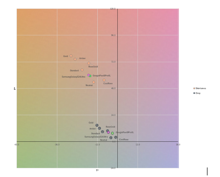
We observed that regardless of the region, scenes in which color made the difference on user preferences in our Insights studies, these undertone settings would surely affect user-preference rankings.
In our Insights studies, we observed that regardless of the region, there were scenes in which color played a deciding role in users’ preferences. We believe that Apple’s new undertone settings would have affected those user-preference rankings.
We also observed in our Insights the large extent to which exposure was playing in users’ preference rankings. This aspect remains unchanged for different undertone settings, so users’ pain points are unlikely to be resolved solely with the default settings available in the undertone modes in the cases where exposure was the main criterion. Exposure can be adjusted but only by diving deeper into the feature and playing with the tone pad.
What did our small group of individuals prefer?
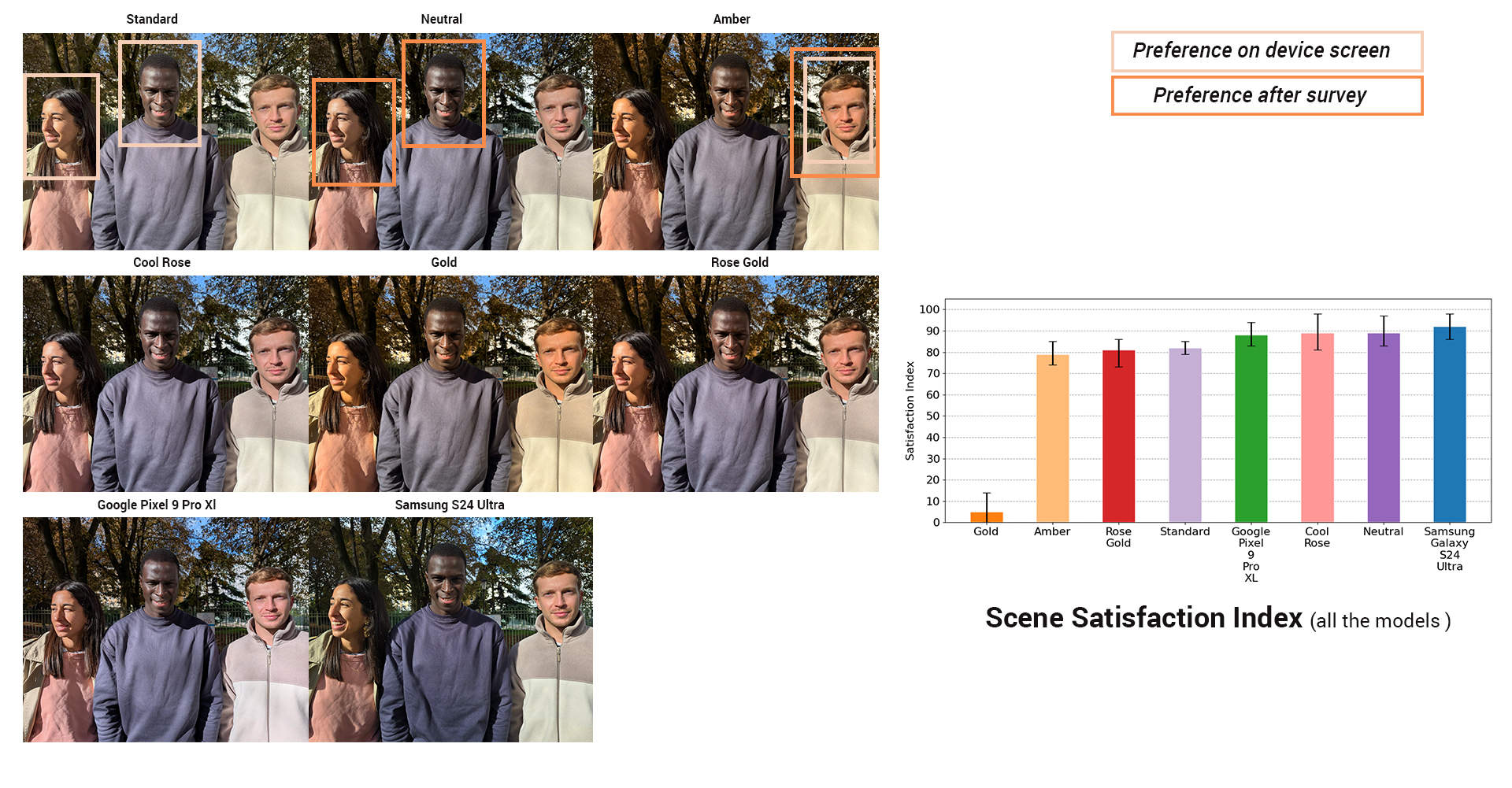
The results of our experiment in Paris showed that our 10 participants generally preferred the Apple iPhone’s Standard rendering as well as the Cool Rose, Neutral and Rose Gold tones over the default tones of the Samsung Galaxy S24 Ultra and the Google Pixel 9 Pro XL.
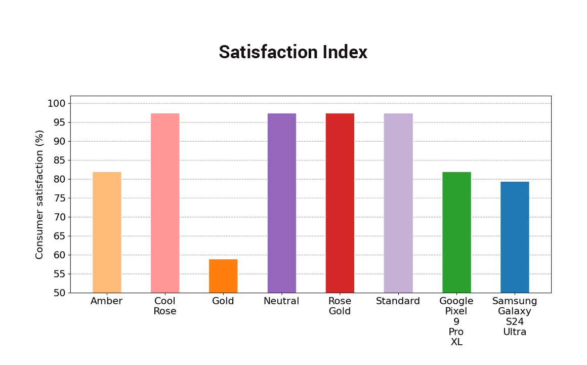
The consumer satisfaction (the percentage of scenes for which the Satisfaction Index was higher than 70) among the four preferred iPhone tones was generally equal. What was more revealing was the overall low preference for the iPhone’s Gold and Amber tones in our test group, even though some individuals selected those renderings as the best in certain circumstances.
It was also interesting to note that undertone preferences differed in some cases when viewing an image directly on the device versus on a computer screen, confirming that the monitor on which an image is viewed can influence a user’s preferences.
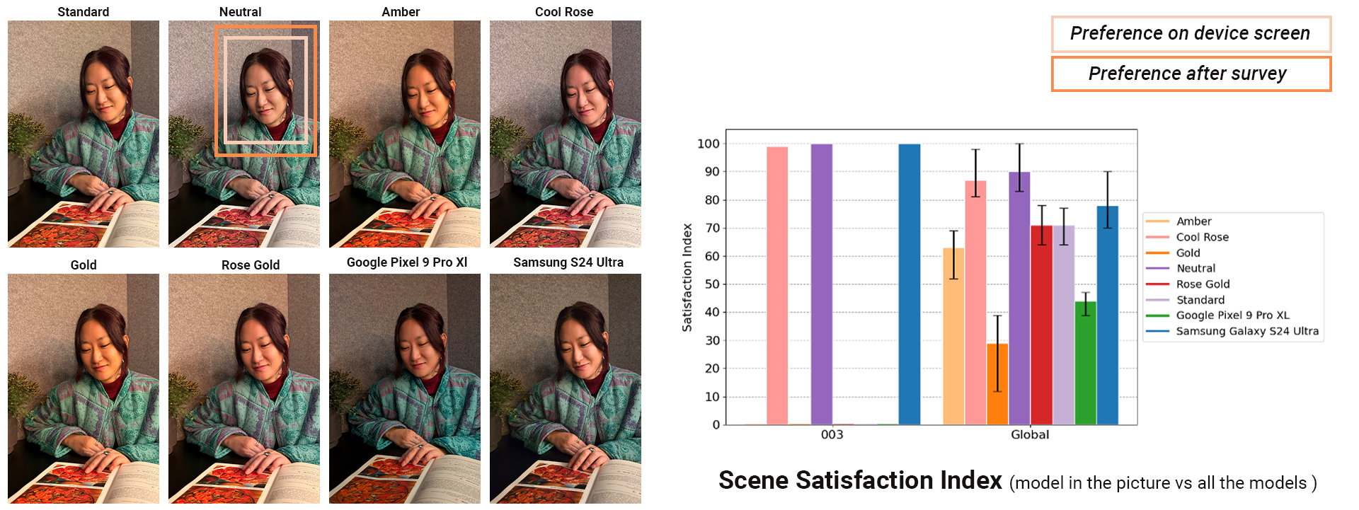
When looking at the results per individual, the preferred renderings varied widely, sometimes even from scene to scene. This showed that sometimes there was no dominant preference even for the individual. The ability for the user to experiment with and to fine-tune an image’s tones before or after the capture on a smartphone shows the degree of importance that some manufacturers are now placing on individual preferences. Providing individuals with the tools necessary to personalize every image the way they want is sure to lead to a more satisfying consumer experience.
While advanced mobile photographers were likely already using third-party apps such as Lightroom Mobile or other filter apps to personalize their images, but we’ve hardly seen a feature like this being so integrated into a device’s default camera app that opens such a degree of personalization to every user.
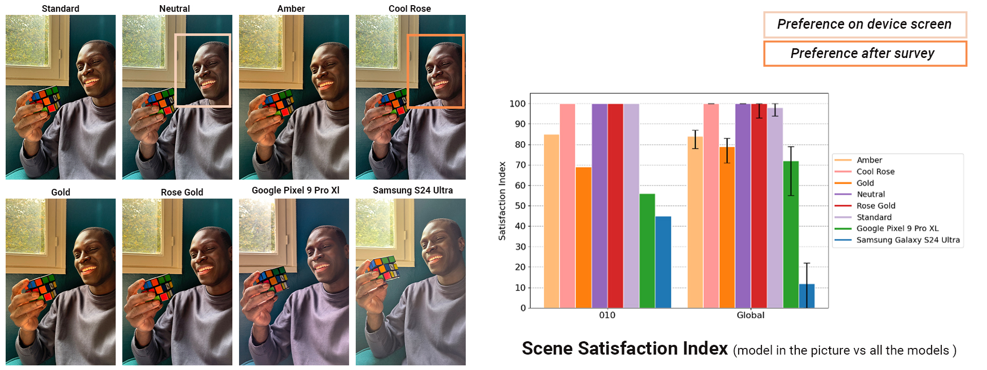
The iPhone 16 Pro’s undertone feature, however, did show some limitations when it came to group photos. In photos with multiple people, our experiment showed that the iPhone 16 Pro’s Standard and Neutral tones were almost as preferred as the images from the Google Pixel 9 Pro XL and the Samsung Galaxy S24 Ultra.
But when questioned separately, each person in the photo had a different preference, and the current feature does not appear to allow to fine-tune specific portions of the photo with different undertone.
In our Insights study in Paris last year, we identified specific indoor scenes on the iPhone 14 Pro Max that were clearly not the favored renderings, such as the example below.

In this example, the subject in the scene preferred the Google rendering, while most other participants preferred the Samsung rendering. Looking at the measurements for these images, we see that face exposure was similar between the iPhone and Google, but that the skin-tone color measurement showed a more saturated rendering for the iPhone.*
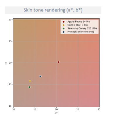
Scenes like the one above from our Insights Paris in which the iPhone 14 Pro Max rendering was not preferred (most likely because of color), we are confident to conclude from our recent small study that the iPhone 16 Pro Max’s undertones would have been both significant and subtle enough to provide a rendering that would have shown a much higher satisfaction of the scene.
The need for further study
It has been over a month since the iPhone 16 series has been released, and it will take some time to see how people end up using these undertones features and how it impacts user satisfaction.
But our small experiment in Paris showed that people have varying degrees of individual preferences, depending on the scene–a finding that corresponds with the results from our much larger Insights study in Paris, which showed the huge impact that undertone settings can have on a user’s satisfaction of a portrait.
This indicates that smartphones that give users the capability and the options on hand to adjust to those preferences will always gain a slight advantage over those products that don’t.
In addition, some participants changed their minds about their preferred undertone renderings, choosing one after viewing the images “live” on the devices but choosing another undertone preference when viewing the image later in standardized conditions. The benefit of Apple’s undertone feature is that it gives users the means to change their minds about their preferred renderings at any moment — before or after capture — and regardless of the visualization conditions. This is a step in the right direction when it comes to increasing consumer satisfaction.
In its quest to continuously improve the end-user experience, DXOMARK will continue to monitor and measure the impact of user preferences on the innovative features from the latest flagship devices.